- The client
- E-Fits Apparel, a clothing brand
- What I made
- The logo and its colours and type, shown in mockups on clothing tags, a shopping bag and a shopfront
- Tools
- Photoshop and Illustrator
- Year
- 2023
A logo that fits
E-Fits Apparel needed an identity with the energy of the brand: a logo, a colour and type system, and the tags, bags and signage a clothing label lives on.
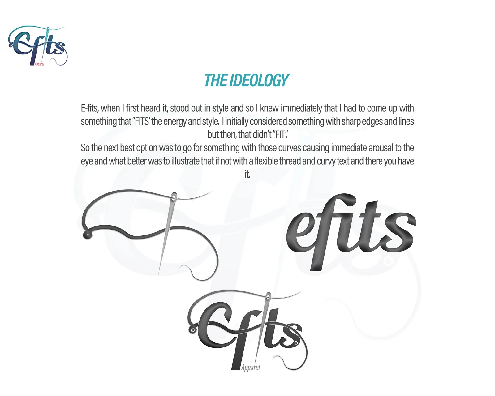
“E-fits, when I first heard it, stood out in style and so I knew immediately that I had to come up with something that “FITS” the energy and style. I initially considered something with sharp edges and lines but then, that didn’t “FIT”. So the next best option was to go for something with those curves causing immediate arousal to the eye and what better was to illustrate that if not with a flexible thread and curvy text and there you have it.”
Thread, curves and colour
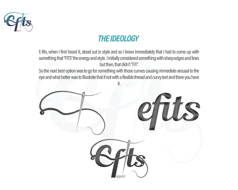
The idea: a flexible thread and curvy text. 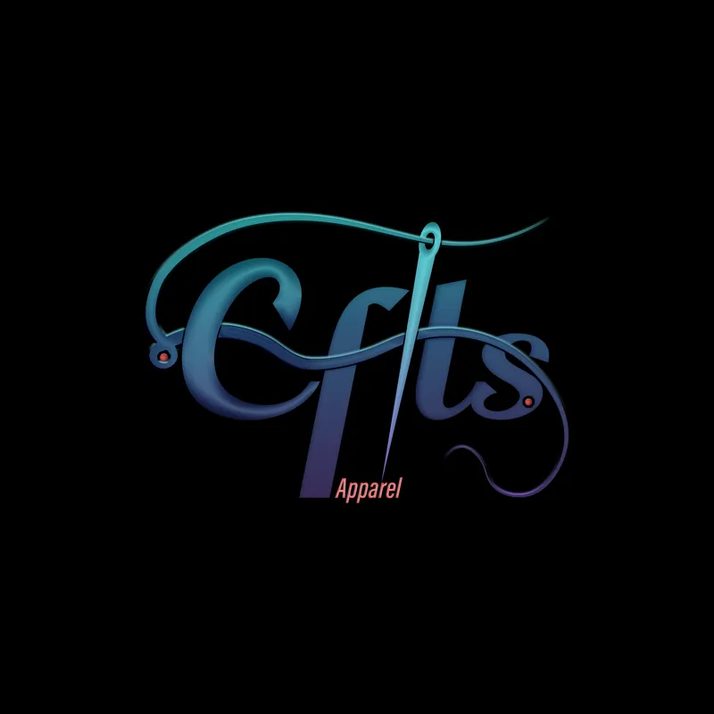
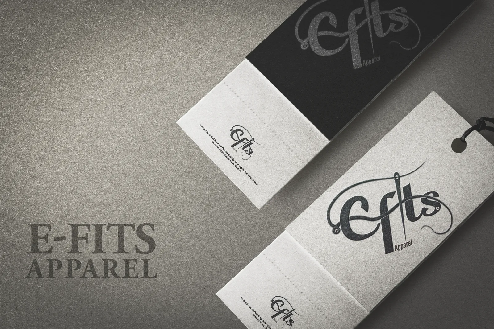
The logo on dark. 
The logo on light. 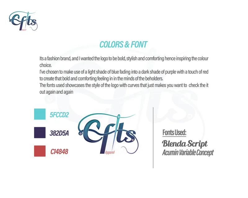
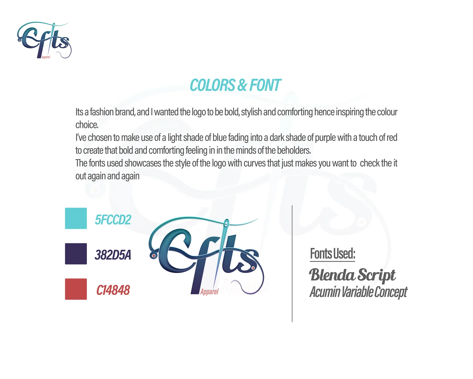
Colours and fonts. 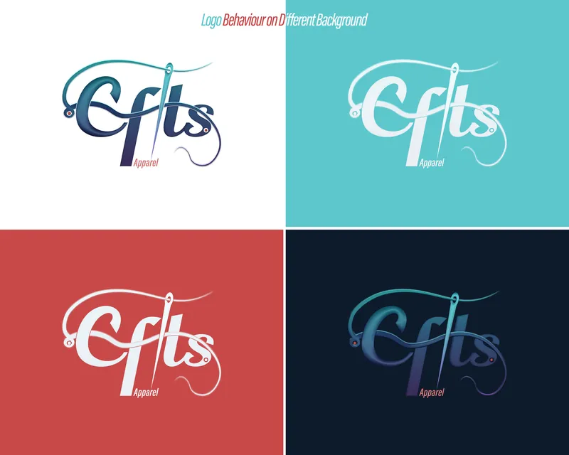
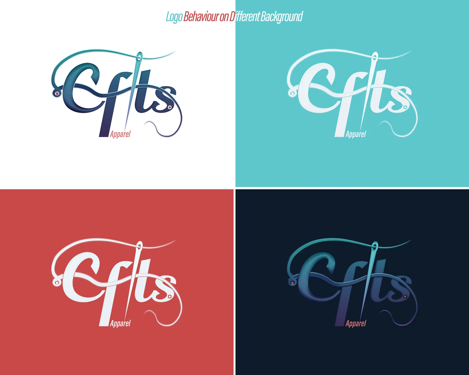
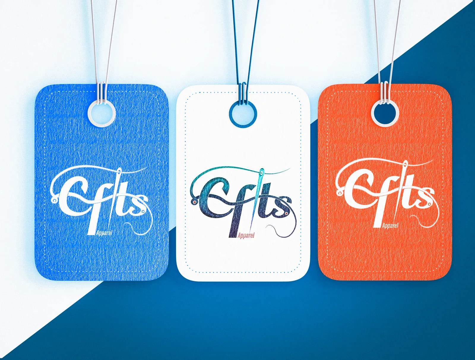
The logo on each brand colour. 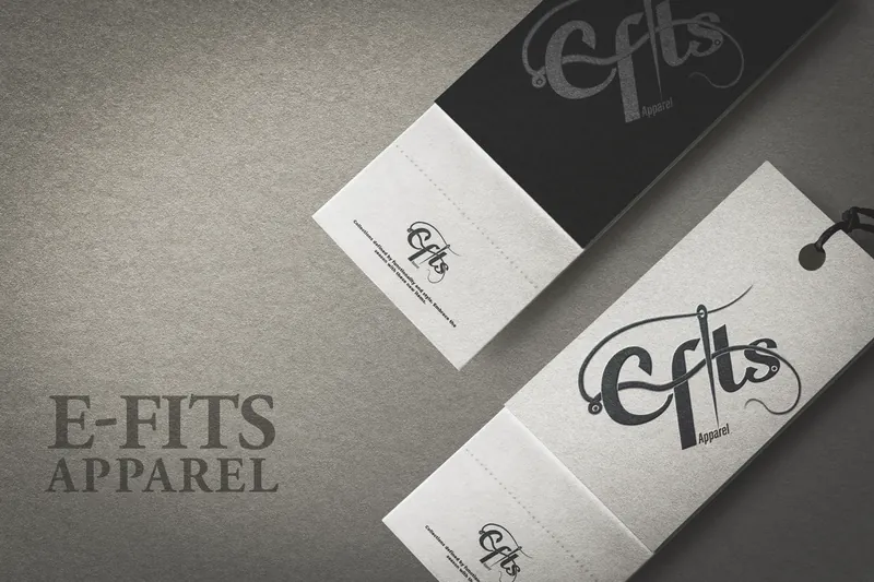
Clothing tags. 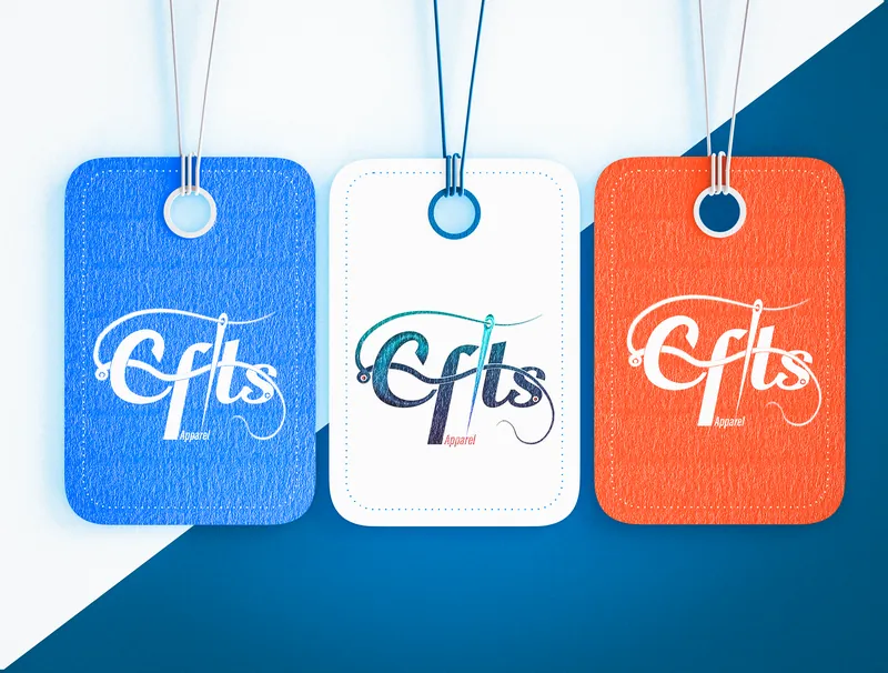
Hang tags in the brand colours. 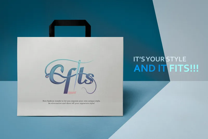
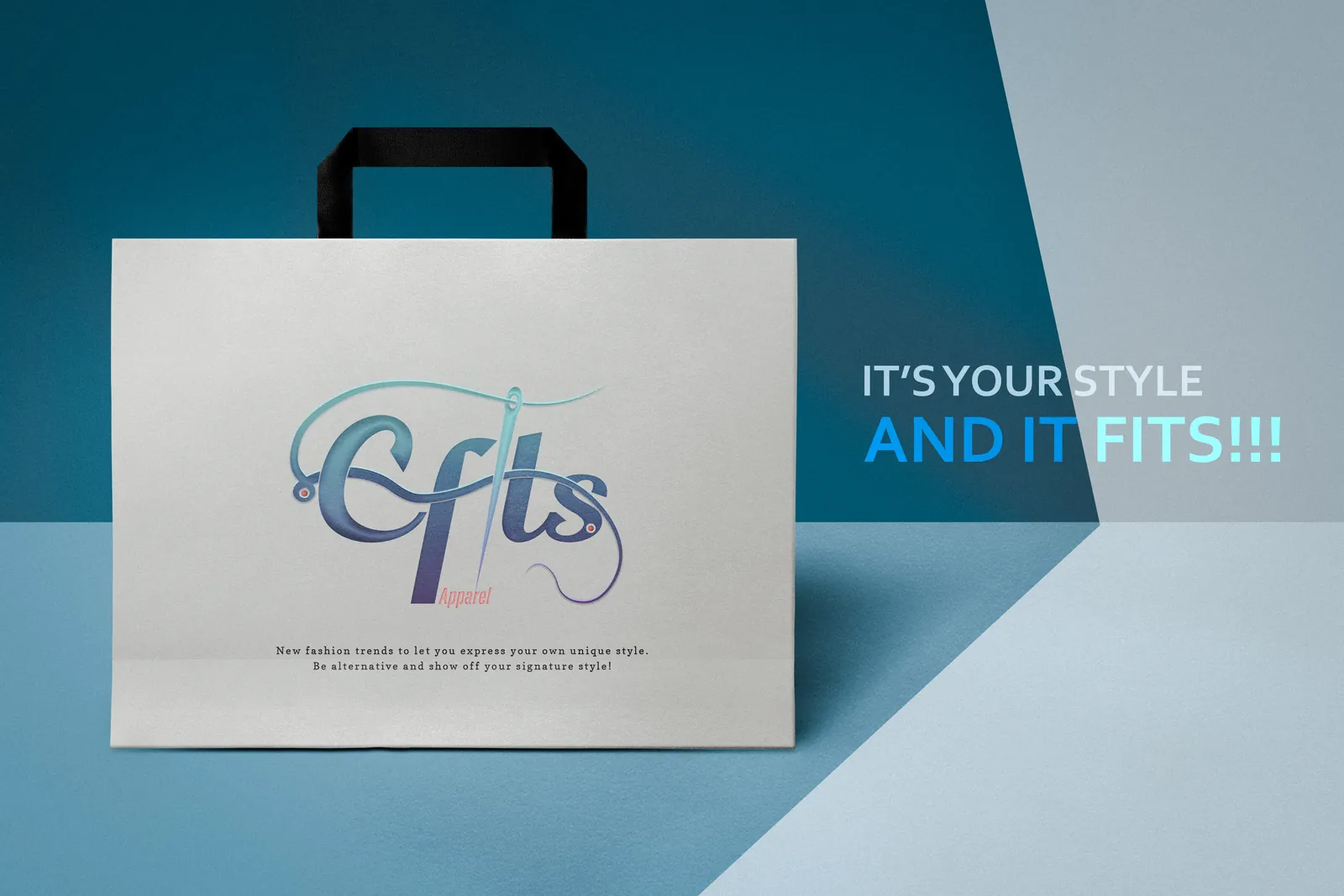
Shopping bag. 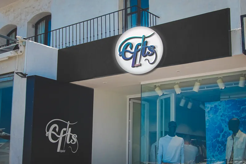
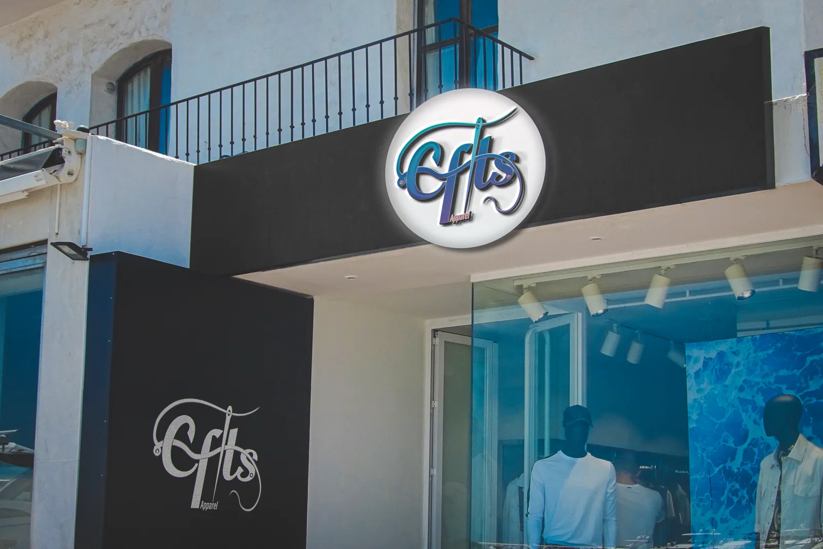
Mockup: the logo as a shopfront sign.